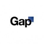
Gap withdraws new logo after drawing some flak
Clothing chain Gap has backtracked on the launch of its new logo after drawing severe criticism especially online.
Gap’s new logo with a small blue square on the upper right part triggered a firestorm of rebuke and criticism from its customers and graphic designers on the Internet soon after it was revealed on the company’s website on Monday.
Just three days after its logo revamp, the company posted in its Facebook page that it was “thrilled to see passionate debates unfolding,” and was starting a “crowd sourcing” program to elicit better logo ideas.
Details of the new project are yet to be announced.
“We love our version, but we’d like to…see other ideas,” the statement said.
The new logo was chosen because it was “more contemporary and current”, according to Marka Hansen, Gap North America president.
Hansen said that Gap would note their customers’ ideas “and “work together as we move ahead.”
Gap’s logo revamp was part of the brand makeover which was started two years ago. The new logo was designed by New York-based creative firm Laird & Partners.
The maligned new logo has been used in Gap’s North American online site but has not been featured in its U.K. and European websites.
Dorothy Wolden of Arizona-based graphic design firm Creative Intuition said that she “kept thinking it must be a joke” when she first saw the new logo.
“I guess we just don’t understand in the first place why they had to change what they already had. Wolden said. “The brand equity that they had with the old logo was just tremendous.”
