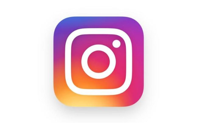
New Instagram Logo Draws Strong Reactions From Users
There is a new Instagram logo as the photo-sharing service owned by Facebook update its Android and iOS apps recently. The new design is flatter and has multiple colors. A redesign was also made on the other apps of the service.
The old Polariod-inspired design of the service was changed into a brighter rainbow accent with a minimalist appearance. The same treatment was also given on Hyperlapse, Boomerang and Layout, which already have a modern design since they were launch long after Instagram.
Ian Spalter, head of design of the service, said the change was aimed at making the design consistent with the aesthetics of the users of the application. He wrote on Medium indicating that the logo and design did not reflect the community and they wanted to make it better.
In addition to the new Instagram logo, a number of visual modifications were also made on the app. The black and white design initially came out last month as it made its way into the Android and iOS apps.
The new design made the apps cleaner and less colorful. All text in the application is now in black and white while the notification icons became red from its original orange color. Spalter indicated that the even as the logo was changed, they believe the color is based on the photos and videos of the community.

New Instagram Logo Draws Strong Reactions From Users - image credit: telegraph.co.uk
In addition, the navigational icons were also updated on the two versions of the flagship application to give them a native feel in their respective platforms. However, the new Instagram logo drew strong reactions from users. Some users were not pleased with the new design and others questioned the choices of the design.
While a major change was expected, many believed the old design was increasingly becoming dated. The old logo was a holdover from an earlier design philosophy where virtual objects reflect their real-world counterparts. However, making the change was not quite straightforward as outlined by Spalter on his Medium post.
The first step in making the new Instagram logo was to flatten the original icon. The process started in the latter part of last summer. Early iterations of the design emerged last August even as the company assured at that time that the icon of the app will not be changed.
However, Spalter indicated that it required more than simply flattening the icon. Earlier efforts in flattening the icon did not have the same visual impact of the original. The icons appeared solid due to the skeumorphic style used on earlier iOS version. Due to this, the team looked into the rainbow of the app to make it brighter and bolder compared to the previous design to convey energy and warmth.
The camera icon was later redesigned to make the new Instagram icon hint at a camera, but putting the foundation for changes in the future.